How the work takes shape.
Notes, experiments and visual studies from inside DMA.
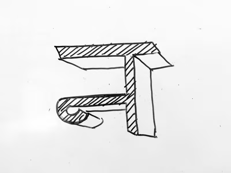
Finding the right voice: The typographic evolution of Land Palace.
Before arriving at the final identity, we explored dozens of typographic directions. The challenge was balancing heritage with a modern, premium feel. These early sketches and digital drafts show the progression from raw concept to refined execution.
Process and exploration.
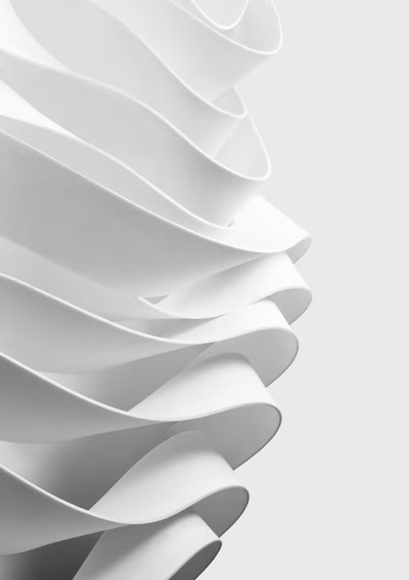
Early geometric studies for the GuideMe visual system.

Pantone matching and paper texture experiments.

Waffarly moodboards focusing on digital trust and approachability.
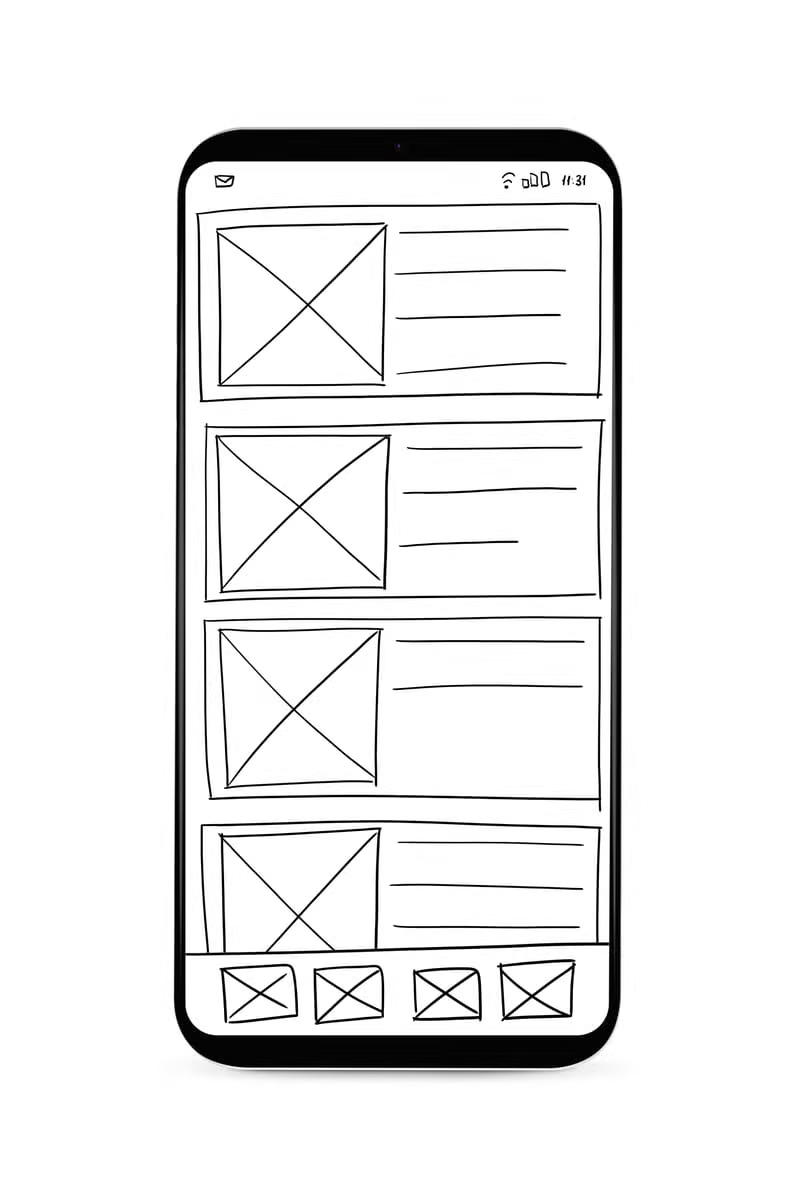
Developing flexible asymmetric layout systems.
Thoughts on the craft.
Simplicity is hard.
Stripping away the unnecessary to reveal the core of a brand is our most challenging phase.
Raw sketches first.
The friction of the pencil forces deliberate decisions before the screen makes it too easy.
Type as image.
Often, the strongest visual asset a brand owns is a highly curated typographic treatment.
DMA is an independent brand and communication studio working with ambitious businesses across Egypt and the GCC.